The Mirage of Metrics: Chasing Causality in L&D
By Matt Richter
Introduction: The Problem with Confusing “Caused By…” and “Goes With…”
Picture this: it's cold, it's wet, and you're outside without a coat or umbrella. Grandma would swear you'll catch a cold unless you "button your neck" and wear a hat. And she's not alone — many people believe that cold weather causes illness. But they're wrong. Viruses cause colds and the flu, not chilly air. So why do more people get sick in winter? One reason is that we spend more time indoors, in closer contact with others. That's correlation — cold weather and illness occur together, but it’s not causation. Confusing the two is dangerous because we end up solving the wrong problem, bundling up instead of washing our hands or avoiding shared surfaces. We mistake a relationship for a root cause and wind up warm, stylish, and still sneezing.
The mantra of this article is that causation includes correlation, but correlation doesn't mean causation. In other words, causation likely has correlation, but the inverse isn’t true. You can, and many times do, have correlation without causation.
In L&D, we continually strive to justify our existence. Let's be honest — whether it's a stakeholder asking for "proof" that our leadership program works, or a CFO wondering if an eLearning investment moved the needle, we're usually not far from a metrics conversation.
That conversation inevitably involves data, such as completion rates, knowledge retention, behavioral indicators, performance scores, and promotion statistics, among others. And once data is on the table, someone — often with little grounding in actual research methods — will start using words like “impact,” “effectiveness,” or “results.”
That’s when things get dangerous.
Because what they’re usually describing is correlation (two things happening together), but what they want to believe — or claim — is causation (one thing directly influencing the other). And those are not the same. Failing to understand the difference is not just poor science. It’s poor practice, and worse, it leads to poor decisions.
So let’s get this right.
The Basics: What Is Correlation? What Is Causation?
Let’s define both terms in plain English.
Correlation is when two things tend to happen together. They move in the same direction or opposite directions, but we’re not saying why. We’re just saying: “When this thing changes, that thing also changes.”
Causation means that one thing directly makes another thing happen. It’s not just about being seen together — it’s about one producing the other or directly affecting the other.
So, correlation is a pattern. Causation is a mechanism. Later, we will discuss regression — a key and essential correlation tool, but one that is often confused with causation.
For example, imagine your company rolls out a new coaching initiative for mid-level managers. A few months later, you notice those managers’ engagement scores improved. Great! You might say, “Coaching improves engagement.”
But that’s only a correlation — unless you can rule out all the other variables that could also be at play. Perhaps engagement increased because the economy improved. Or a bad senior leader left. Or a compensation boost happened around the same time. Unless you isolate for those things, you can't claim causation.
Or maybe management implemented several different interventions simultaneously to improve engagement (if it’s a problem, they tend to throw the kitchen sink at it), so it’s impossible to know which action actually had an impact.
In L&D, we are almost always operating in environments with multiple, dynamic, and complex variables.
Why This Matters for Us
A lot of L&D claims are based on correlations dressed up as causal relationships. We see it in vendor pitch decks: “Organizations that use our solution saw a 19% increase in retention.” We see it in internal reports: “People who completed our program were promoted faster.” We even see it in executive conversations: “The new onboarding program is driving performance.” But none of these claims hold water unless we can demonstrate that the intervention caused the outcome, not just that they occurred around the same time.
Why does this matter?
Because when we mistake correlation for causation, we:
Invest in the wrong things
Mislead stakeholders (even unintentionally)
Fail to improve, because we’re not learning from real evidence
Undermine our own credibility
Worse still, we start creating training, coaching, or content as a reflex to correlated data, rather than based on actual needs or systemic understanding. If we want to be evidence-informed, credible, and strategic in L&D, we must get this right.
Statements You Might Hear That Are Likely Correlations
Let’s look at what correlation looks like in our context:
“People who took the course scored higher on the test.”
Sounds promising, right? But maybe only the high performers bothered to take the course. That’s selection bias, not impact.
“Teams with more training had better sales results.”
What if those teams already had better managers who motivated them to take the training, fostered stronger cultures, or were working on easier accounts?
“Employees who did our onboarding stayed longer.”
Perhaps they were more motivated to begin with or better prepared for the job. Or perhaps the ones who didn’t finish onboarding left early because they were going to leave anyway.
All of these are correlational. There is an association. But we haven’t proven that one caused the other.
How to Know If Something Is Causal
Causation is harder to prove, but it’s possible. Here are some key signs you’re getting closer:
Time Order. Did the intervention come before the outcome? If coaching happened after the engagement boost, it can’t be the cause. If training came before the performance change, it might have been involved.
Control for Confounders. We’ll talk more about confounding variables later. Are you isolating other variables that could explain the change? Did you control for department, tenure, geography, or the quality of the manager? Did the training group differ significantly from the non-training group?
Random assignment. AKA, the gold standard. Did you randomly assign employees into a training group and a no-training group, and then compare their outcomes? If so, and all else is equal, any difference is more likely to be caused by the intervention. Of course, randomization isn’t always possible in L&D (for ethical, logistical, or organizational reasons). But the closer you get to that kind of structure, the better.
How did the change happen? Are you able to explain this? For example, “Participants gained new skills in negotiation, practiced them, and then reported more successful deals.” If there’s no plausible pathway, it’s harder to justify causality.
Consistency Across Contexts. If you see the same outcome across different populations, times, or conditions, causality becomes more likely. “In three departments across different regions, the same training led to a 10% increase in feedback quality.” That’s stronger than one isolated bump.
Examples You Should Recognize
Let’s ground this with a few more detailed scenarios.
Example 1: Leadership Training and Promotion Rates
Claim: “Managers who completed the leadership program were promoted 30% faster.”
Reality Check: This is a correlation. What else could be going on? You’ll recognize this scenario from its introduction above.
Maybe high-potential managers were selected for the program.
Maybe the program was only offered in high-growth departments.
Maybe it was part of a broader succession planning push.
Or, those who completed the program were in the pool from which the promotions were chosen.
To claim causation, you'd need to show that, controlling for other factors, participants advanced faster because of the program.
Example 2: Sales Enablement and Revenue Growth
Claim: “Teams that used the new sales enablement platform increased revenue by 18%.”
Reality Check: Sounds great, but maybe:
Those teams had better territory assignments.
A product launch happened around the same time.
The teams were already outperformers.
I hear an echo… This is a correlation. To get to causation, you'd want to test the platform with similar teams, randomly assigned, over a controlled time window.
Example 3: DEI Workshop and Retention of Underrepresented Talent
Claim: “After the DEI workshop, retention of underrepresented employees improved.”
Reality Check: Maybe. But perhaps:
A new mentorship program was also launched.
A toxic leader left. Those toxic managers are everywhere!
Speaking of toxic leaders, perhaps one was so disgusted by the workshop that they left it and therefore was not included in the follow-up assessment.
Hiring slowed, changing the denominator.
The poor, beaten horse is near death. Correlation is not Causation — especially in complex cultural initiatives.
So, What Should You Do?
We don’t all need PhDs in statistics. But we do need a healthy skepticism and some practical habits of mind. Here’s how to get sharper.
1. Stop Making Causal Claims Without Evidence. If you don’t have the structure or data to prove causality, don’t say you do. It’s more credible, not less. Use language like:
“There is an association between…”
“We observed a pattern suggesting…”
“Further analysis is needed to establish causality.”
2. Push for Better Data Design. We don't always control the systems, but we can influence them. Better design = better insights.
Propose A/B testing where possible. (Thank you, Will Thalheimer — who is always blowing the A/B horn.)
Collect pre- and post-measures.
Include comparison groups (even if not randomized).
Track timing carefully.
3. Educate Stakeholders on the Difference. This is part of our role now. When an executive says, “This new program improved our culture,” you can gently push back with, “There’s a correlation, but let’s explore what else could explain that change — and whether we can isolate the program’s unique contribution.” Ideally… hopefully, they’ll respect the rigor. Or, sadly… they may disrespect the implied extortion😳.
4. Embrace Mixed Methods. Another word for this is triangulation. Sometimes, causality can be supported through qualitative data, interviews, focus groups, and open-ended feedback. If multiple employees report that a program shifted their mindset, and their managers confirm behavioral changes, that helps build a causal narrative, even if it's not a controlled experiment.
5. Tell Smarter Stories. When you do share results, be transparent about what you can and can’t say. Don’t overhype. Instead of saying, “The training caused a 20% drop in errors,” say, “We observed a 20% drop in errors following the training rollout. While this is promising, we’re investigating other contributing factors and looking for patterns across departments.” It’s honest. It’s strategic. It’s sustainable. And that nuance builds your credibility.
A Few Mental Models to Keep Handy
When in doubt, these ideas help keep your brain in check:
Post hoc fallacy: Just because B happened after A doesn’t mean A caused B.
Selection bias: If only certain people participate, your results are skewed.
Regression to the mean: Extreme performances tend to even out over time — don’t assume a training “fixed” something.
Simpson’s paradox: Group-level trends can hide subgroup reversals. Always check deeper cuts.
Embrace the Messy Truth
The messy reality is that most of what we do in L&D takes place in complex, noisy environments. You won’t always get neat experimental conditions. But that doesn’t mean you should give up on thinking clearly. The more chaos there is, the more valuable it is to speak with precision, work with rigor, and avoid sloppy thinking.
Correlation is not a dirty word. It’s a starting point. But if you care about learning that changes things — and not just check-the-box content — then you need to get curious about causality. Ask better questions. Look deeper. Build better data systems. And when in doubt, don’t bluff.
You’re not just here to deliver training. You’re here to improve performance, solve problems, and influence the system. That means you need to know how the system actually works, and that starts with knowing the difference between what causes something and what just happens to go with it.
What’s the Math Behind Correlation and Causation?
My friend, Clark Quinn, now would say… “Show me the math!” But the rest of you can stop here if you don't want to dig deeper into the mathematical structures of causation, correlation, and then regression. If you prefer to skip the math, go to the later section titled, “So… (If You Skipped the Math—Rejoin Here!)”
OK, Clark… Let's say someone in your organization drops this on your desk:
“Our data shows a correlation between leadership training and team performance, so we know the training caused the improvement.”
Stop. Take a deep breath. Before you nod — or worse, repeat it — let's talk about how correlation and causation are handled statistically. Because it's one thing to say two things are related. It's another to proveone did the other.
Let's unpack what the math is doing under the hood. You don't need to become a data scientist, but you doneed to know when the data is stretching the truth.
How Correlation Is Calculated
The Basics: The Pearson Correlation Coefficient… Oh My!
Correlation measures how two variables move together. Are they in sync? Out of sync? Or independent?
So let’s say someone drops a report in your inbox, and right there in bold font it says: “r = 0.68 between training hours and performance ratings.” You’re supposed to look impressed. Maybe nod knowingly. Maybe go build a slide that says “Training Drives Results.” But hold on. What does r = 0.68 actually mean? And how should you interpret that little number without overpromising or underreacting?
Let’s walk through it.
The statistical tool we use here is the Pearson correlation coefficient, often written as r. It tells you how strongly two variables move together.
r = 1.0 → Perfect positive correlation. As one goes up, the other always goes up.
r = -1.0 → Perfect negative correlation. As one goes up, the other always goes down.
r = 0 → No correlation. The variables are completely unrelated.
That’s it. It’s a measure of how well one thing predicts another, but it doesn’t tell you why they’re related — or if one causes the other. That’s where folks get tripped up.
You’ll see Pearson’s r pop up in all sorts of dashboards and evaluation reports, especially when someone’s trying to prove a program works. It might look like the following:
“There’s a strong correlation (r = 0.62) between coaching participation and employee engagement.”
“We found a weak correlation (r = 0.21) between eLearning completion and call resolution time.”
“No correlation (r = -0.03) was found between feedback training and retention.”
It looks scientific. And to be fair, it can be useful. But context matters.
What the Ranges Mean
Here’s a rule of thumb when you see a correlation coefficient:

In L&D, anything above 0.4 usually makes people perk up, but it should also make you pause. Why? Because even a high correlation might be hiding something else. Selection bias. Confounding variables (more on these shortly). Measurement issues. Correlation alone doesn’t prove impact.
A Quick Example: Coaching and Engagement
Let’s say you measure how many hours of coaching managers receive and their team’s engagement scores.
You find: r = 0.58
That’s a strong positive correlation. Coaching hours go up. Engagement scores go up. Sounds promising.
But before you call it a win, ask:
Were the higher-performing managers more likely to ask for coaching in the first place?
Did the coaching cause the engagement boost, or are both just symptoms of good leadership already in place?
Could there be something else, like a new comp policy or a recent reorg, that’s actually behind the shift?
You don’t dismiss the r = 0.58. But you don’t worship it either. It’s a clue, not a conclusion.
Another Example: Training and Turnover
You check the correlation between the number of training courses completed and voluntary turnover, hoping to see that training keeps people from leaving.
You get: r = -0.18
That's a weak negative correlation. Maybe a small trend that folks who train more leave less, but not enough to base a strategy on.
It could be noise. It could be real. The people most likely to stay may also be the ones who are more motivated to complete the training. Again, a clue, not proof.
So…
The Pearson correlation coefficient is like a pair of binoculars — it helps you see whether two things are moving together. But it doesn’t tell you why. Or what to do about it.
Your job isn’t just to spot a pattern and report it. It’s to think critically about whether that pattern means something worth acting on. So next time someone flashes a shiny r-value at you, don’t be afraid to ask:
“Is this a strong relationship? Or just a curious coincidence?”
That’s how you move from dashboard reader to insight generator.
Now, the Formula (But Don’t Panic)
Here’s the actual math:
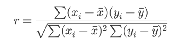
Let’s break it down without the algebra migraine:
In plain English: You’re asking, “When one variable changes, does the other tend to change in a consistent direction?”
An Example
Say you’re tracking two variables:
Number of leadership training sessions completed
Team engagement scores
You collect this data from 100 managers. You run the correlation and find r = 0.45. That tells you: “These two things tend to go up together.” But remember — it doesn’t tell you why they’re going up together.
It could be that high-performing teams have more training opportunities. Or that better managers care more about development. Or that a third variable — like supportive senior leadership — is influencing both.
So… again… dead horse moment… a correlation is just that: a relationship. It’s the start of a question, not the end of an answer.
CONFOUNDING VARIABLES
Before we dive into more mathematics, we have to understand the variables we are working with — mainly confounding. A confounding variable is a fancy name for reasons why something is correlated and not causation. Confounding variables mess with your results. You think A is affecting B, but really, there’s a hidden C pulling the strings behind the scenes. It’s like saying, “People who bring umbrellas cause it to rain.” Nope. There’s a confounder—the weather. People bring umbrellas because it’s raining. The rain is influencing both variables (people and umbrellas), but you wouldn’t see that unless you’re looking for it.
Confounding variables mess with your ability to tell what’s actually causing what. They introduce bias by making it look like there’s a relationship between two things, when it’s really something else pulling those strings. That kills internal validity, your confidence that your intervention caused the outcome. How do we handle them?
Randomize when you can
Control for them in your design or analysis
Measure and include them as variables if they’re known
And above all, question your assumptions—ask what else could be influencing the result.
So, keep in mind these different factors that relate to your overall topic. Determine what is what and then hypothesize and test.
How We Test for Causation Statistically
Now comes the tricky part. Causation requires showing that one variable produces a change in another. And in statistics, that’s harder to pin down.
Here are the major tools and tactics we lean on when trying to get at causality.
1. Experiments and Randomized Controlled Trials (RCTs)
If you want real causal insight, this is the gold standard.
Here’s the idea:
You take a group of people.
You RANDOMLY assign them to two groups: (1) One gets the intervention (say, a new onboarding program). (2) One does not.
You measure the outcomes of both groups.
Because the assignment is random, you’ve controlled for other variables — confounding variables like motivation, department, and prior skill. That makes any difference in outcome more likely to be caused by the intervention.
L&D example: You randomly assign half of your new hires to a redesigned onboarding experience. The other half gets the old one. You track the time it takes to reach productivity. If Group A consistently ramps faster, you’ve got a causal claim with teeth.
Reality Check: Most L&D teams don’t run randomized trials. We deal in observational data. But that doesn’t mean we can’t get smarter.
We also need to design these RCTs properly, taking into account methodological factors such as sample selection, sample size, and other relevant considerations. We’ll tackle these issues in future articles.
2. Difference-in-Differences (DiD)
This one is useful when you can’t randomize but have a before-and-after setup with a comparison group.
You measure both groups before the intervention, then after. If the treated group improves more than the untreated group, you’ve got a possible causal effect.
Example:
Group A and Group B both score a 70 on a performance test.
You run a new training program for Group A.
A month later, Group A scores 85, Group B scores 72.
Group A improved more, and that extra improvement (13 points vs. 2) might be attributed to the training.
It’s not perfect, but it’s stronger than just saying “scores went up after training.” It also assumes your test is good, as well.
3. Instrumental Variables (IV)
Now we’re getting into nerd territory, but here’s the idea. Let’s say you want to know if training causesperformance, but training is self-selected (people choose to attend or not). That creates bias. An instrumental variable is something that is correlated with training participation but not directly with performance. You use that variable to isolate the causal impact of training.
Example: Let’s say people who live closer to the training site are more likely to attend, but proximity doesn’t affect performance. You can use “distance from training” as an instrument to model the causal impact of training.
If your head is spinning, then good. That’s how IV models make everyone feel. Most L&D teams don’t use them, but it’s good to know they exist — and that some vendors throwing around the word “causal” might be overreaching unless they use models like this.
Regression
But I bet you are wondering where the granddaddy of all correlation and causation tools is… Good ole’ regression analysis. Regression is one of the most used tools in the correlation toolkit when actual experiments aren’t possible.
Let’s say Grandma is baking cookies. Suppose she wants to know how much the amount of sugar affects the sweetness of the cookies. In that case, regression analysis involves keeping track of all the batches she has made, comparing the amount of sugar used in each, and seeing if more sugar really does make the cookies sweeter.
It’s not just about guessing. It’s about using math to look at real results and say, “When I change this, here’s what usually happens to that.”
So, in work terms: If you want to know whether giving more training hours leads to better performance scores, regression helps you figure out how strong that connection is, and whether it’s likely real or just a fluke.
Let’s say you’re trying to figure out whether increasing manager check-ins leads to higher employee engagement scores. You might use something called simple linear regression to explore the relationship between those two variables. The formula looks like this:

In L&D terms, this means:
Y is the thing you care about — like engagement scores.
X is the thing you think influences it, like the frequency of check-ins.
a is the starting point (what engagement would be if no check-ins happened).
b is the impact of each additional check-in.
This gives you a way to estimate: If I increase check-ins by one per month, how much might my engagement improve? That’s your slope, aka your b value. You’re drawing a straight line through your data points to see the general trend. Is it better? Or does it not really matter?
It’s not about proving cause and effect — at least not yet — but it’s a solid step toward understanding patterns that might help you make smarter decisions in your learning programs.
In other words, this equation represents the best-fitting straight line (also called the “regression line”) through a set of data points in two dimensions. The goal of regression is to estimate the values of a and b so that the line best fits the observed data. What the heck does that mean, you ask?
Well, imagine you have a bunch of dots on a piece of paper. Each dot shows two things about an employee: how many training hours they completed, and how well they performed afterward.
Now, you want to draw a straight line that comes as close as possible to all those dots. Not perfect — just the best you can do with one straight line. That line helps you see the overall pattern: as training hours increase, does performance usually increase too?
Regression is just the fancy math that determines where to start the line (the intercept) and how steep the line should be (the slope) so that it fits the dots as nicely as possible.
The goal? A line that helps you say, “Usually, when this goes up, that goes up by about this much.”
Now, if you think more than one thing is influencing engagement — like manager check-ins, team size, and whether remote workers are included — then you’re looking at a multiple regression.
That formula looks like this:
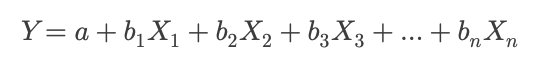
Same idea, but now you’re modeling multiple predictors at the same time. It lets you ask: How much do check-ins matter, even when we account for team size and remote status?
This is especially useful for us because we often deal with messy, overlapping factors. Performance isn’t just about one learning event. It’s about systems, habits, and context. Multiple regression helps us tease apart the impact of each factor, so we don’t give credit to the wrong thing.
The key point is that regression can suggest causation when designed well, but it can't prove it without a proper research setup. It’s only as good as the variables you include.
BUT… REGRESSION IS NOT EXPLICITLY CORRELATION… AND DOES NOT EQUAL CAUSATION.
At its core, regression analysis extends the idea of correlation. Both tools address how variables interact. In fact, the Pearson correlation coefficient (r) is just a special case of simple linear regression. When you're looking at two variables, r is baked right into the regression math. The regression slope (β₁) and correlation coefficient are mathematically related, especially in standardized data.
In this sense, regression quantifies relationships between variables in a more detailed and structured way than simple correlation. For example, correlation tells you, “Training hours and engagement scores go up together.” Regression tells you, “Each training hour predicts a 3-point bump in engagement, controlling for other variables.”
Dead horse moment… Regression doesn't automatically prove causation!
This is where people get it wrong. Just because a regression gives you a number — a tidy coefficient with a nice p-value[i] — does not mean you've proven a causal link. Regression only shows association, not causation —unless the study is specifically designed to do so. Suppose your data comes from an observational source (e.g., HRIS data, LMS logs, survey results). In that case, regression will tell you if two things move together while adjusting for other variables, but not why they move together.
The classic trap is this:
“We ran a regression.”
“The coefficient is significant.”
“Therefore, the training caused the outcome.”
Nope. Not without:
Random assignment
Strong theoretical justification
Control for confounding variables
Or an instrumental variable / quasi-experimental design
Otherwise, you're still in correlation territory — just dressed up with fancier math. Think of regression as a tool that sits between correlation and causation. It provides more than a simple correlation because it accounts for multiple variables simultaneously. That's helpful. But it still doesn't get you to causation, like a well-run experiment might. Why? Because you can't rule out unseen variables, hidden biases, or stuff you didn't measure.
It’s kind of like trying to figure out what’s happening in another room by listening through the wall. You’ll pick up patterns — voices, movement, tone — but you’re not getting the whole picture. There’s just too much you’re guessing about.
Here’s how you might frame that for a stakeholder:
“We used regression to estimate how different factors — like training hours, tenure, and manager quality — relate to performance. It gives us a clearer picture than looking at one thing in isolation. However, to truly claim that something caused the change, we’d need a design that controls for other explanations. This gets us closer, but it’s not the smoking gun.”
That kind of honesty builds trust, and positions you as someone who understands both the power and the limits of the tools you’re using.
Alright… back to our regularly scheduled program and some specific regression examples.
Some Examples
1. Simple Linear Regression Example #1: Manager Check-Ins and Engagement
Let’s say you’re curious whether more frequent one-on-ones with a manager lead to higher engagement. You run a regression with this formula:
Engagement Score = a + b * (Monthly Check-Ins)
You collect data from 100 teams and get a result like:
Engagement Score = 60 + 4 * (Monthly Check-Ins)
This indicates that if a team receives zero check-ins, their expected engagement score is 60. But each additional check-in per month boosts that score by 4 points. So, a team with three monthly check-ins would have a predicted engagement score of 72.
Now — is that causation? Not necessarily. But it's a strong signal of a relationship. Something worth digging into and maybe testing further.
2. Simple Linear Regression Example #2: Completion Rates and Course Ratings
Let’s say your LMS reports that higher course completion rates are associated with better learner satisfaction scores. You test that:
Satisfaction Score = a + b * (Completion Rate)
Let’s say you get:
Satisfaction Score = 3.0 + 1.5 * (Completion Rate)
If a course has a 0% completion rate, you’d expect a satisfaction rating of 3.0 (on a 5-point scale). But for every 10% bump in completion, the score increases by 0.15 points. Therefore, a course with a 70% completion rate would be expected to yield a 4.05 satisfaction score.
3. Multiple Regression Example #1: Training Hours, Team Size, and Performance
Now let’s raise the complexity. You want to know what drives post-training performance. Is it just the number of training hours that matters? Or do other factors, like team size or manager support, play a role?
You run a multiple regression:
Performance Score = a + b1 * (Training Hours) + b2 * (Team Size) + b3 * (Manager Support Score)
The output looks like:
Performance Score = 50 + 2 * (Training Hours) – 1 * (Team Size) + 3 * (Manager Support Score)
Here’s what this tells you:
Every hour of training boosts performance by 2 points.
Bigger teams drag performance down by 1 point per person (maybe due to stretched management).
Manager support is a huge lever — each point of improvement there boosts performance by 3.
Multiple regression lets you see the unique contribution of each factor while controlling for the others. That’s critical, as outcomes are rarely shaped by just one thing.
4. Multiple Regression Example #2: Predicting Promotion Readiness
You want to understand what predicts whether employees are seen as “ready for promotion." You collect three variables, which, let's be clear, I'm not endorsing as inherently valid predictors. But they are often the usual suspects HR likes to throw into the mix:
Leadership course completion (yes/no)
360˚ feedback scores
Number of cross-functional projects led
Your formula:
Promotion Readiness Score = a + b1 * (Course Completion) + b2 * (360˚ Score) + b3 * (Projects Led)
Or, filled in, the regression model looks like:
Promotion Readiness Score = a + 5 * (Course Completion) + 2.5 * (360˚ Score) + 1.8 * (Projects Led)
The results say:
Completing the leadership course adds 5 points.
Each point on the 360˚ adds 2.5 points.
Each project led adds 1.8 points.
This paints a clear picture: formal learning, peer perception, and hands-on experience all show up in the model, but not equally. And that kind of insight helps you prioritize development strategies for high-potential talent without guessing.
What Can Make Regression Go Awry?
1. Confusing Correlation with Causation
And we are right back where we started! Just because your regression shows a strong relationship doesn’t mean one variable caused the other. Training hours might predict higher sales, but maybe higher performers just seek out more training. Regression doesn't know which came first. It quantifies associations, not intent or direction. “Our coaching program caused a 10-point jump in performance.” Maybe the top 10% of performers just opted into coaching.
2. Leaving Out Important Variables (Omitted Variable Bias)
If your model is missing a key variable, the coefficients you do get might be misleading. It’s like trying to explain why someone is late without knowing they had a flat tire. For example, let’s say you’re looking at eLearning usage and job performance, but you ignore tenure. Well, veterans might both use eLearning more and perform better, making it look like the platform is magic, when really it’s just their prior knowledge and experience.
3. Too Many Variables (Overfitting)
It’s tempting to think: “Let’s throw all our data into the model—the more, the better, right?” Not so fast. Overfitting occurs when your regression model begins to memorize the quirks and randomness of a specific dataset, rather than learning the general patterns that apply to new ones. In other words, the model isn’t spotting a signal — it’s getting distracted by noise. Let’s say you build a model to predict learner engagement. You toss in everything: course ratings, time spent in modules, LMS login frequency, number of Slack messages sent, team size, manager tenure, favorite ice cream flavor — you name it. The model looks great. R² is high. P-values are tight. You’re feeling good. But then… next quarter rolls around. You test it on a new group of learners. And boom — it falls apart. Predictions are way off. Engagement doesn’t follow the pattern you expected. Why? Because the model learned the random idiosyncrasies of the first group, not the underlying truths that generalize across time or teams. You trained it to be too specific. The bottom line is that more variables don’t automatically yield a better model. They often make a more fragile one. You want a model that simplifies wisely, not one that impresses on paper and collapses in the real world.
4. Multicollinearity (Predictors That Step on Each Other’s Toes)
If your independent variables are too closely related — like manager check-ins and pulse survey feedback — the model can’t tease apart their individual effects. The math breaks down, the coefficients bounce around, and your interpretation becomes a house of cards. Red flag: “We found coaching frequency predicts performance… but wait, so does manager quality… and now neither is statistically significant?!” You’ve got multicollinearity.
5. Garbage Data In, Garbage Insight Out
Regression assumes that the data is accurate, clean, and relevant. If your LMS records false completions or your 360 scores are riddled with rating inflation, your model will reflect that garbage. For example, you show a strong link between course completions and sales, but it turns out that most of those completions were people clicking “next” without reading anything.
6. Assuming Linearity When the Relationship Isn’t
Regression draws a straight line, but not every relationship is linear. In reality, some effects plateau or curve. Perhaps more feedback helps, but it may also overwhelm the employee. If you assume linearity, you'll miss the nuance — and possibly recommend the wrong intervention.
7. Ignoring the Error Term (Real-World Messiness)
All regression models include an error term — the stuff it can’t explain. That leftover noise is often where the messiest, most human, most unpredictable parts live. If you forget that no model explains everything, you start trusting it a little too much. The danger: “Let’s only invest in the top three predictors of readiness.” Okay, but don’t kill off the nuance, complexity, or judgment that makes leadership development a craft.
Bottom Line
Regression is a spotlight. It highlights patterns. But it’s not a microscope, and it’s definitely not a crystal ball. If you’re thoughtful about your data, careful with your assumptions, and humble about what the model can actually tell you, then it’s a powerful ally.
What Does the Output of a Regression Analysis Look Like?
Let’s say you run a multiple regression to predict employee performance based on three variables:
Training hours completed
Manager support rating
Team size
The output might look something like this (simplified for clarity):

How Should We Interpret This?
1. Coefficients = What Happens When X Changes
Each coefficient tells you how much Y (Performance) is expected to change when you increase X (the predictor) by one unit, assuming all other variables are held constant.
Training Hours = 2.00. Every additional training hour is associated with a 2-point increase in performance.
Manager Support = 3.50. Each one-point bump in support (say, on a 5-point scale) predicts a 3.5-point increase in performance.
Team Size = -1.20. For every extra person added to a team, predicted performance drops by 1.2 points—possibly due to coordination costs or diluted management time.
So you’d say: “Training helps, but support from the manager is the strongest predictor. Bigger teams? They seem to pull performance down a bit.”
2. Intercept = Baseline Score
The intercept (50.00 here) is what the model predicts for performance when all the independent variables are zero. In most L&D cases, you don’t obsess over this — it’s just the starting point. It’s only meaningful if zero is a realistic value for your predictors.
3. p-values = Statistical Significance
Each p-value tells you whether that predictor is statistically significant — i.e., whether the relationship is likely to be real rather than just noise.
Conventionally, p < .05 means the result is significant.
In our case, all three predictors meet that threshold.
So you’d say, “All of these predictors have statistically significant relationships with performance.” If a p-value had been high (e.g., 0.45), that would mean the variable likely doesn’t belong in the model, or at least doesn’t have a reliable impact.
4. R-squared = How Much Variance the Model Explains
Here, R² = 0.68, which means the model explains 68% of the variation in performance scores.
That’s very high for social science and workplace data.
We can reasonably interpret this as: “Our three predictors explain most (but not all) of what’s driving performance. There’s still about 32% we’re not capturing—maybe personal motivation, role fit, etc.”
So… (If You Skipped the Math—Rejoin Here!)
You don’t need to run your own regressions (unless you like that kind of thing). But you do need to ask the right questions when someone brings you a claim about “what caused what.”
Ask things like:
How was the data collected?
Were people randomly assigned?
Was there a comparison group?
Were confounding variables controlled for?
How strong is the effect? (What’s the size, not just the significance?)
Is there a plausible mechanism that explains why this works?
Claims of cause should demand an immediate, “Show me.” Claims of relationship may only be because the data were cherry-picked. We must be cautious about what we accept as “fact and evidence.” So…
Think Like a Causal Detective
In the end, you’re not here to memorize formulas. You’re here to think critically. When you see a bump in engagement, ask: “What else changed at the same time?” When you hear that a program “drove” business results, ask: “Compared to what?” When you present your own findings, be honest about what you can say and what you wish you could say.
In L&D, your job is to help people learn, but also to help the organization learn about itself. That means being careful, curious, and clear-eyed when looking at cause and effect. And if you want a good rule of thumb? Just remember:
Correlation is easy.
Causation is hard.
But lazy thinking is lethal.
What Can Go Wrong (That We Still Haven’t Talked About Yet)
Let's be clear — getting correlation and causation mixed up isn't just a technical error. It's a thinking error. And it can screw things up in subtle, cascading ways that aren't always obvious at first glance.
You Design the Wrong Solution
One of the most common misfires? Solving the wrong problem. You look at a correlation and assume you know what’s driving it, then launch an entire initiative aimed at the wrong target.
Imagine this: You notice that employees who attend optional learning sessions tend to score higher on engagement surveys. You think, “Aha! Learning events drive engagement!” So you start offering more sessions, scheduling lunch-and-learns, even throwing in some gamification. However, it turns out that it wasn’t the events driving the engagement. It was found that engaged people were more likely to attend. You were treating the symptom as the cause and designing backwards.
Now you’ve wasted resources, overloaded calendars, and your stakeholders are wondering why nothing improved.
You Accidentally Perpetuate Inequities
Here’s one people don’t like to talk about. Correlation-based decisions can deepen bias. Suppose you conduct an analysis that reveals high performers tend to come from a specific set of schools or regions. If you take that correlation and turn it into a selection criterion — voilà! — you’ve just institutionalized a bias disguised as “data-driven” insight.
The same applies to assessments of gender, race, tenure, or personality. Without understanding the whybehind the correlation, you risk embedding systemic inequities and calling it “science.”
You Undermine Trust in L&D
When your business partners start to get that sniff of overclaiming — when they sense that your conclusions don’t quite add up — they stop listening. It doesn’t matter how enthusiastic your dashboard looks if the story isn’t tight.
You only get so many chances to show that L&D insights are real insights. If the stats feel slippery, the whole function loses credibility. Correlation dressed up as causation is a great way to erode your seat at the table quietly.
Final Tips and Tricks for the Rest of Us
If you’re not a statistician — and most of us aren’t — that doesn’t mean you’re powerless. There are practical habits that can keep you grounded when the data starts flying.
Ask “What Else Could Explain This?”
Always start by challenging the obvious. What else could be causing the outcome? If your answer is “nothing,” you’re probably not thinking hard enough.
Look for Comparison Groups
Even if you can’t run a perfect experiment, always ask:
“Compared to what?”
No improvement story is complete without a baseline or a control group of some kind. Otherwise, you don’t know if your program worked or if everything just got better across the board.
Don’t Fall for “Statistical Significance” Alone
Just because a result has a little asterisk or a low p-value doesn’t mean it matters. Ask about effect size —that tells you how much of a difference it actually made. Sometimes the effect is so small.
Use Time to Your Advantage
If you can show that changes occurred after the intervention — and not before — you’ve at least got a decent starting point. Timing won’t prove causality, but it helps eliminate impossible claims (e.g., training can’t cause performance that happened before it was delivered).
Be Humble, Be Honest, Be Curious
The real trick isn’t fancy stats — it’s intellectual integrity. Say what you know, admit what you don’t, and stay curious. That’s more credible than trying to sound like a quant wizard when you’re not.
Conclusion: Know What You’re Saying and Why It Matters
Here’s the bottom line: We are in the business of shaping people — how they think, act, perform, lead. But if we want to be taken seriously as part of the business, we have to show we understand how learning actually affects outcomes. And that means we have to know the difference between something that looks connectedand something that is caused.
It’s not just semantics. It’s the difference between acting on good information and acting on a hunch that looks like evidence.
Correlation is seductive. It's easy to compute, it shows up fast in dashboards, and it usually confirms what someone already wants to believe. But causation? That takes work. It asks us to slow down, think more deeply, look more closely, and become a little uncomfortable with our assumptions.
In the real world, very few L&D teams are running full-scale experiments. Budgets are tight, politics are real, and data is often messy. But that's all the more reason we need to be smart about what we can and can't say. When we start with clarity about the difference between correlation and causation, we make better decisions. We ask better questions. We design better programs. And we earn more trust.
The stakes are higher than most people realize. When we mistake correlation for causation, we don't just mess up a dashboard; we also risk misinterpreting important findings. We risk building solutions to problems that don't exist. We waste people's time and attention. We miss the real levers of change. And worst of all, we might double down on the wrong ideas just because the numbers looked good at first glance.
This isn’t about becoming a statistician. It’s about thinking like a systems-savvy professional who understands the limits of the data and the importance of asking the next question.
In a field where every decision we make could shape how someone grows, performs, or stays (or leaves), we owe it to our learners — and our organizations — to get this right. So next time you hear someone say, “Our training program caused a 20% bump in productivity,” take a breath and ask:
“What else could explain that? Did we compare it to anything? How do we know that’s what really caused the bump?”
Not to be annoying. Not to play gotcha. But to actually make learning smarter. That’s not being difficult. That’s being responsible. And in today’s data-drenched, narrative-driven business world, that kind of clear thinking isn’t just rare — it’s powerful.
REFERENCES
Beresford, B. (2022). Making the leap: Correlation to causation. Training Industry Magazine.
Berkman, E. T., & Reise, S. P. (2012). A conceptual guide to statistics using SPSS. Sage Publications.
Cook, T. D., & Campbell, D. T. (1979). Quasi-experimentation: Design and analysis issues for field settings. Houghton Mifflin.
Freedman, D., Pisani, R., & Purves, R. (2014). Statistics (4th ed.). W. W. Norton & Company.
Frost, J. (2019). Regression analysis: An intuitive guide for using and interpreting linear models. Statistics by Jim Publishing.
Rohrer, J. M. (2018). Thinking clearly about correlations and Causation: Graphical causal models for observational data. Advances in Methods and Practices in Psychological Science, 1(1), 27–42. https://doi.org/10.1177/2515245917745629
Sackett, D. L., Rosenberg, W. M., Gray, J. A., Haynes, R. B., & Richardson, W. S. (1996). Evidence-based medicine: What it is and what it isn’t. BMJ, 312(7023), 71–72. https://doi.org/10.1136/bmj.312.7023.71
Wheelan, C. (2013). Naked statistics: Stripping the dread from the data. W. W. Norton & Company.
Wiggins, G., & McTighe, J. (2005). Understanding by design (2nd ed.). ASCD.
[i] I've talked about the p-value in other articles. But here is a quick review and definition. The p-value is all about statistical significance. It tells you how likely it is that your results happened by chance. In other words, the p-value was small enough to convince us this probably didn’t happen by dumb luck. The smaller the number, the more confident you can be that the effect is real and not just a fluke. If the p-value is less than 0.05, statisticians usually call it “statistically significant.” Just don’t confuse that with important. That’s a different question. For example, let's say you run a new management program. Employee engagement scores go up. P-value = 0.02. That means there’s only a 2% chance the improvement happened randomly, so yeah, probably worth paying attention to. This also assumes you designed the evaluation correctly.